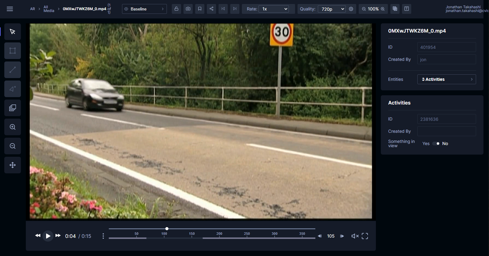
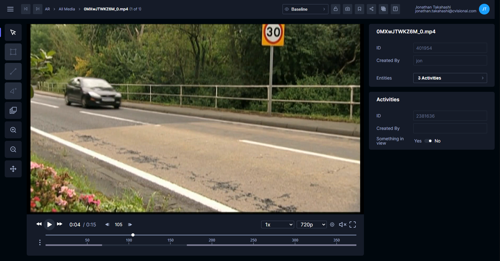
As we close in on our first versioned release of Tator, we have made several improvements to the layout of the annotation view. Our overarching goal was to group the controls more logically, declutter the menu bar at the top of the page, and address some annoyances around "jitter" in control positions. Below are the old and new views for comparison:


Prev/next buttons
Navigation buttons are now located to the left of the breadcrumbs. The key here is that the position of these buttons never change, so if you are cycling through a lot of media the buttons won't move on you. We also think placing them next to the breadcrumbs (which indicate current list position) made sense.
Player controls
We moved the rate and quality controls down with the other player controls, such as volume, full screen, and the scrub bar. The scrub bar now sits under the buttons so that it can use the full horizontal width of the video. This is especially useful on activity recognition projects that use advanced timeline features.
Entity browser
The entity browser is due for some dedicated layout adjustments, but for now we have just slightly increased its width.
Try it out
We expect to roll out the new annotation view along with the analytics view in the next couple weeks. If you are on Tator Cloud (tatorapp.com), you can preview the new annotation view now by visiting https://test.tatorapp.com. This preview deployment uses the same database services as tatorapp.com, so you log in with the same credentials and can annotate as you normally would. We do not recommend using it for launching workflows, uploads, or custom scripts.
